

Supply and Demand Trading for Forex Beginners
At some point, most traders who discover supply and demand end up with a chart full of coloured rectangles. Every pause in price got a…

At some point, most traders who discover supply and demand end up with a chart full of coloured rectangles. Every pause in price got a box. Every candle cluster got circled. The chart looks busy. The strategy still does not click.
The problem is usually not the concept. It is the drawing. Most traders mark zones from the wrong part of the candle. They mark zones that have already been tested three times. They draw on the one-hour chart while a daily zone sits directly above or below their entry.
Supply and demand trading is not complicated. But it requires knowing exactly what makes a zone valid, what makes it weak, and what makes it no longer relevant. This article covers all three.
Key Terms
| Term | What it means |
| Demand zone | A price area where buyers overwhelmed sellers, causing a sharp upward move. When price returns, a similar reaction may occur |
| Supply zone | A price area where sellers overwhelmed buyers, causing a sharp downward move. When price returns, a similar reaction may occur |
| Base | The short consolidation or pause that forms just before a sharp move. This is where the zone is drawn |
| Impulse | The sharp price movement that follows the base. A strong impulse suggests that significant buying or selling pressure was present in the base |
| Fresh zone | A zone that has not been retested since it formed. Fresh zones tend to produce stronger reactions than zones that have been retested multiple times |
| Timeframe authority | The weight assigned to a zone is based on the timeframe in which it was formed. Daily and weekly zones carry more weight than one-hour zones |
What a Demand Zone Looks Like
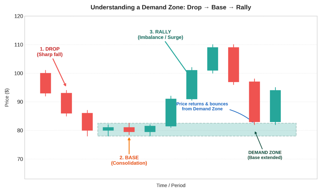
A demand zone forms when price is falling, consolidates briefly, and then moves sharply upward.
The sequence is: drop, then base, then rally. The base is the critical part. It is a short area of compressed price action: narrow candles, small ranges, little overlap between candles. This compression shows that buyers and sellers were briefly in balance. Then buyers overwhelmed sellers, and prices shot upward.
That base is the demand zone. It marks where the buying pressure was concentrated. The base is the area where the imbalance between buyers and sellers was strongest. When the price returns to that level, the same imbalance may develop again.
A demand zone is drawn as a rectangle covering the base. That is the area where the consolidation happened before the upward impulse.
What a Supply Zone Looks Like
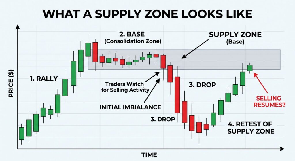
A supply zone forms when the price rises, consolidates briefly, and then moves sharply downward.
The sequence is: rally, then base, then drop. The base shows that the price briefly stabilized before sellers overwhelmed buyers, causing the price to drop sharply. The supply zone is the base. That is the area where selling pressure is concentrated.
When price returns to a supply zone, traders watch for selling activity to resume. The same imbalance between sellers and buyers that caused the initial drop may recur at that level.
The Four Zone Patterns
Every supply and demand zone fits one of four patterns. Each one describes the sequence of the move that created it.
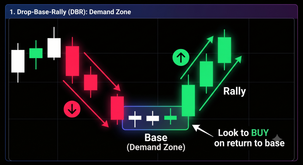
Drop-Base-Rally (DBR): A demand zone. Price drops to the base, pauses, then rallies sharply. This is the most common demand zone pattern. Traders look to buy when the price returns to the base.
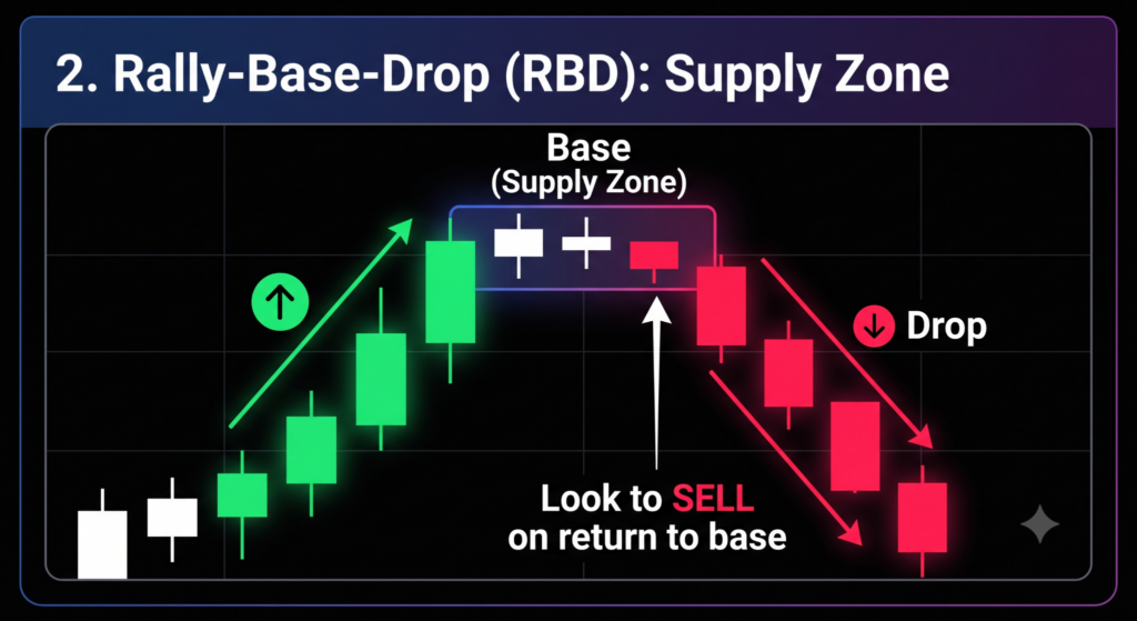
Rally-Base-Drop (RBD): A supply zone. Price rallies to the base, pauses, then drops sharply. Traders look to sell when the price returns to the base.
Rally-Base-Rally (RBR): A continuation demand zone. Price is in an uptrend, pauses briefly, and continues upward. The base in an uptrend shows a pause in buying pressure before the price continued upward.
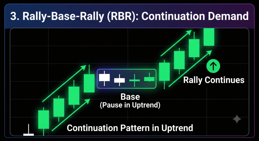
Drop-Base-Drop (DBD): A continuation supply zone. Price is in a downtrend, pauses briefly, and continues downward. The base shows a pause in selling pressure before the price continued lower.

How to Draw a Zone Correctly
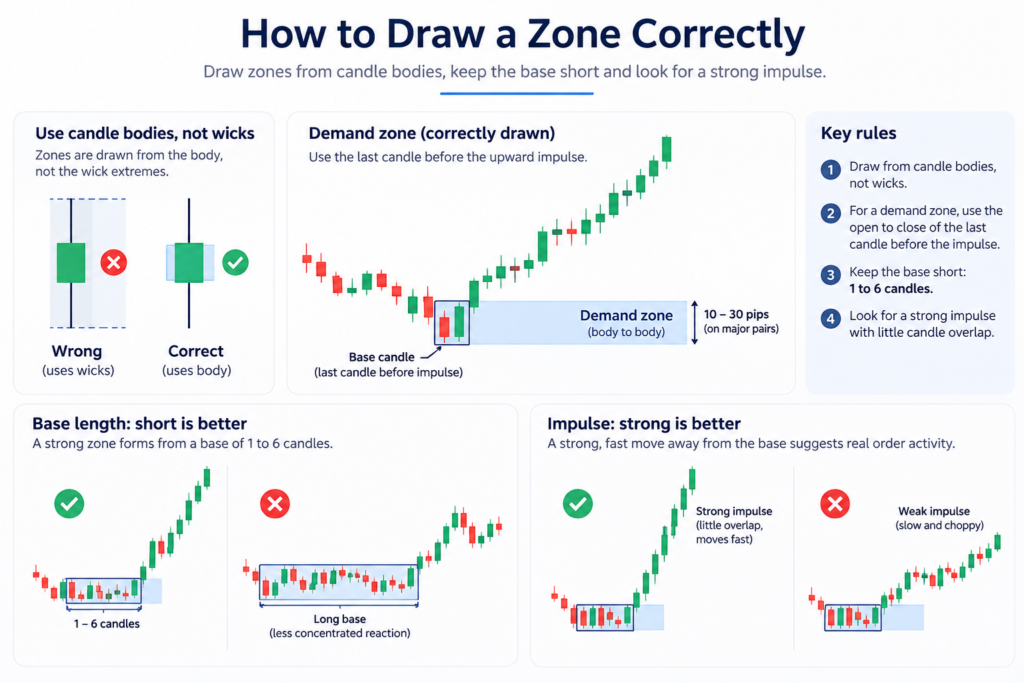
The most common mistake in supply and demand trading is drawing zones from the wrong part of the candle.
Zones are drawn from candle bodies, not wicks.
A wick shows a price level that was tested and rejected. A candle body shows where price traded and held. The zone should cover the body of the base candle. Do not extend it out to the wick extremes.
For a demand zone, identify the last candle before the upward impulse. Draw the zone from the open to the close of that candle body. The zone is typically 10 to 30 pips wide on major forex pairs. It is an area, not a precise line.
The base should be short. A strong zone forms from a base of one to six candles. A longer base means the price spent more time in that area, so more of the activity at that level was absorbed before the price left. Less concentrated reaction potential remains.
The impulse should be strong. A strong departure from the base, meaning candles with little overlap between them moving fast in one direction, suggests that significant order activity was present. A slow, grinding move after the base suggests less conviction.
What Makes a Zone Strong or Weak
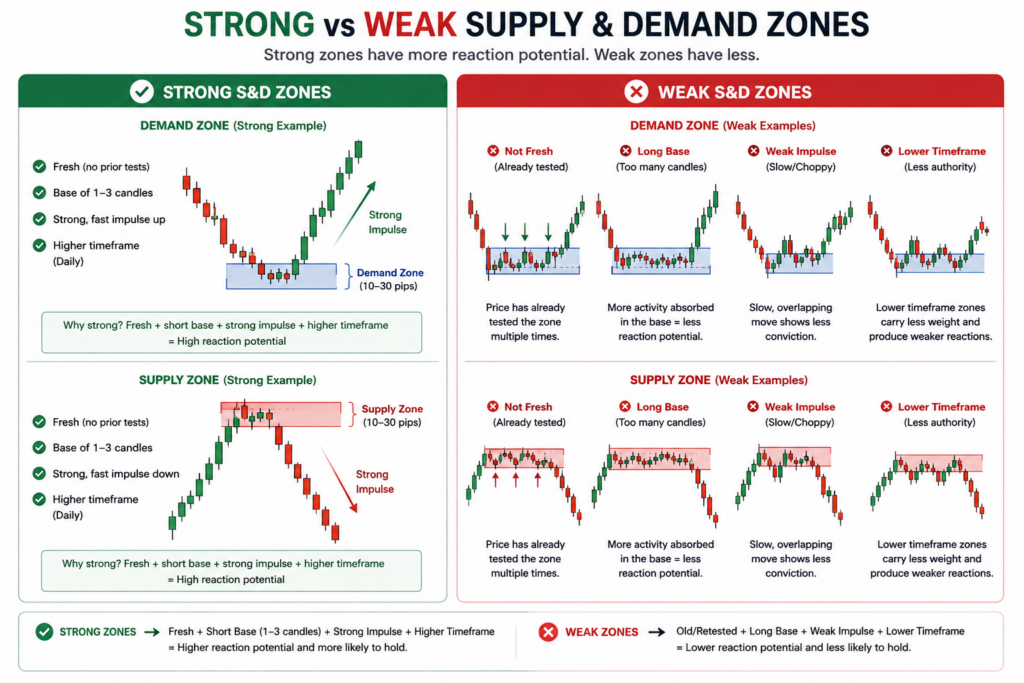
Three factors determine whether a zone is worth trading.
Freshness. A fresh zone is one that has not been retested since it formed. The first return visit to a zone after it forms is the strongest trade opportunity. On every subsequent visit, more of the reaction potential at that level is absorbed. A zone that has been tested two or three times has less fuel remaining for a strong reaction. By the fourth or fifth test, the zone is typically depleted.
This is the most important difference between supply and demand zones and support and resistance levels. Support and resistance get stronger with more touches. Supply and demand zones get weaker. Each test absorbs more of the reaction potential. When that is gone, the zone no longer produces meaningful reactions.
Speed of formation. A base of one to three candles is stronger than a base of ten candles. Fewer candles in the base mean less activity was absorbed at that level before the price left. More reaction potential remains, which tends to produce a stronger move on price’s return.
Timeframe authority. A zone formed on a daily or weekly chart carries more weight than a zone formed on a one-hour chart. Higher-timeframe zones reflect levels where larger moves originated. A zone visible on the daily chart indicates a level that has attracted significant trading activity. A zone visible only on the five-minute chart indicates a smaller, shorter-term concentration.
Supply and Demand Zones Compared to Support and Resistance
New traders often treat these two ideas as the same thing. They are not. The clearest difference is what happens after repeated touches.
Support and resistance get stronger with more touches. Each touch is more evidence that price reacts at that level.
Supply and demand zones get weaker with more touches. Each test absorbs more of the reaction potential in the zone. Once that potential is gone, the zone stops producing meaningful reactions.
| Support and resistance | Supply and demand zone | |
| Shape | A line, or a narrow band | An area with a top and a bottom |
| Drawn from | Prior highs and lows, often wick extremes | The candle bodies of the base |
| What it tells you | Price has reacted here before | A sharp move started here |
| Repeated touches | Make the level stronger | Make the zone weaker |
| Broken when | Price closes beyond the level | A candle closes fully beyond the far edge |
Supply and demand add the reason a level exists. Support and resistance only record that price reacted there before. Many traders use both together.
Zone Invalidation
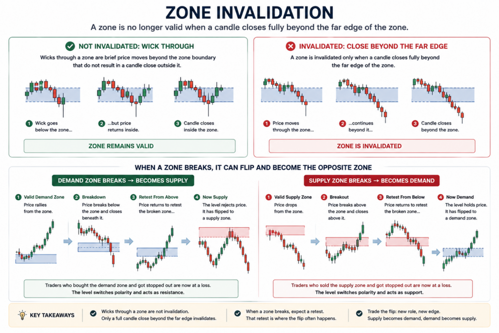
A zone is no longer valid when a candle closes fully beyond the far edge of the zone.
A wick through the zone is not invalidation. Wicks through a zone are brief price moves beyond the zone boundary that do not result in a candle close outside it. Price moves slightly beyond, then returns inside the zone. Only a full candle close beyond the far edge confirms a break.
When a zone breaks, something important happens. A broken demand zone can become a supply zone. A broken supply zone can become a demand zone. When price breaks through a level and returns to retest it from the other side, traders who had positions expecting the zone to hold are now at a loss. The level switches polarity.
How to Use Timeframes
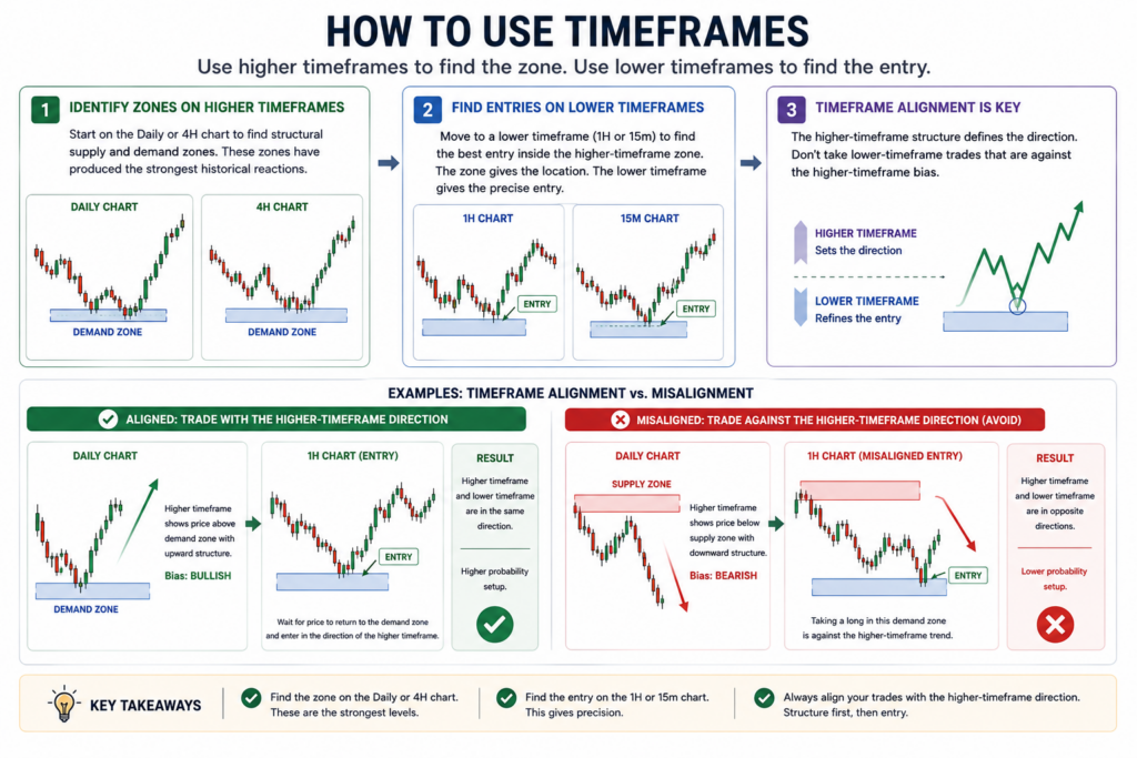
Supply and demand trading works on all timeframes. The most effective approach uses multiple timeframes together.
Start on the daily or four-hour chart to identify the structural zones. These are the zones that have produced the strongest historical reactions. They define where the major reactions are likely to happen.
Then move to a lower timeframe, one hour or 15 minutes, to find the specific entry point inside the higher-timeframe zone. The higher-timeframe zone gives the trading location. The lower-timeframe entry gives the precise position within that location.
The key rule is timeframe alignment. Do not enter a demand zone on the one-hour chart if a supply zone sits just above it on the daily chart. The higher-timeframe structure defines the direction. Trading against it from a lower-timeframe zone puts the setup at odds with the broader structural direction.
Supply and Demand Zones in a Funded Account
Supply and demand is one strategy among many. It does not reduce risk on its own, and it does not suit every trader. It works on a funded account for the same reason it works anywhere else, and it fails in the same ways too.
What a zone does give you is a defined invalidation level. The zone has a far edge. You decide before you enter that a close beyond that edge means the idea was wrong. That gives you a stop level taken from the chart rather than from a round number.
Some traders place the stop a small distance beyond the zone edge. Price can push past a zone briefly and then turn back. A wider stop reduces that outcome. It also means a smaller position for the same money risk.
Zone width changes from setup to setup, so the stop distance changes too. Position size is what keeps the risk of money steady. You decide the risk you accept, measure the distance to the stop, then size the position to match.
Those are two separate steps. The zone gives you the level. Position sizing gives you the dollar risk. A zone on its own tells you nothing about how much to risk.
A funded account has a daily loss limit, so knowing the money risk before entry matters. A trade without a defined stop is a trade without a defined risk. Account size affects the same maths. See How to Pick Your Account Size for a Prop Firm Challenge.
Explore FXIFY’s programs and see which evaluation structure fits your trading approach.
FAQs
What is the difference between supply and demand zones and support and resistance?
Support and resistance are precise price lines, usually drawn from wick extremes, where price has reacted multiple times. More touches make them stronger. Supply and demand zones are areas drawn from candle bodies that represent where the imbalance in buying or selling was strong enough to trigger a decisive move. More touches make them weaker. Each test absorbs more of the reaction potential. Supply and demand adds the context of why a level exists, not just that price reacted there before.
How do I know if a supply and demand zone is still valid?
Three checks: is the zone fresh (not yet retested since it formed)? Does the base consist of fewer than six candles? Is the zone visible on a timeframe that carries institutional weight (daily or four-hour)? A zone that fails any one of these checks is weaker than a zone that passes all three. A zone is fully invalidated when a candle closes completely beyond its far edge.
What is a demand zone in simple terms?
A demand zone is a price area where buyers were strong enough to push the price sharply upward in a single move. The most common explanation is that not all orders were filled before price moved away. When price returns to that level, a similar reaction may develop again.
Does supply-and-demand trading work on all forex pairs?
Yes, but the clearest zones form on major pairs such as EUR/USD, GBP/USD, and USD/JPY. These pairs have the highest liquidity, which means zone reactions tend to be cleaner and more predictable. Lower-liquidity pairs can produce zones with wider price spreads and less predictable price action. Daily and four-hour zones on major pairs during London and New York trading hours tend to produce the most reliable reactions.
Bottom Line
Supply and demand zones mark where buying or selling pressure was strong enough to cause a sharp move. When price returns to those zones, the same imbalance may produce a reaction again.
The strongest zones are fresh, formed from a short base, and visible on a higher timeframe. Each retest weakens a zone. Zones are drawn from candle bodies, not wicks. A zone is broken only when a candle closes fully beyond its edge.
A zone gives you an entry area and an invalidation level. It does not give you a position size. That decision stays with your risk plan on every account, funded or not.
For more on how trading style maps to program choice, see Which Trading Style Is Best for You?.